
Natural Gas Distribution State Pipeline Analysis PART 1: Excel and Tableau Public
The BlueGreen Alliance campaign Repairing our Cities Aging Pipelines (RECAP) aims “to accelerate the repair and replacement of this network to create hundreds of thousands additional jobs while addressing the urgent threat of climate change.” This is part of the BGA Clean Energy Initiative.
I worked on a couple projects looking at the mileage of leak-prone distribution pipelines and causes of leaks in two states, Minnesota and Indiana. My job was to summarize the data collected on distribution pipelines by the Pipeline and Hazardous Materials Safety Administration (PHMSA) for each of the states. This data is collected from each pipeline operator and provides the number of miles of pipeline by material as well as number of leaks by cause.
Once I put together the summaries that showed a snapshot of the distribution pipeline system in the state, we would add it to a handout that also included information about the broader state of distribution pipeline systems including nation-wide numbers on leak-prone pipelines and jobs numbers. We then used this handout to start a conversation with stakeholders including front line gas workers, environmentalists, and the community.
We discovered that this was an important step because the data only show part of the picture. For example, in Minnesota we learned that leak detection numbers for at least one utility were increasing because they had recently piloted a new leak detection technology that was able to find smaller leaks. We learned from talking to gas workers that some utilities are proactive with efforts to decrease leaks in their systems, and others are more reactive and respond to leaks after the fact. It also became clear that there are nation-wide concerns about the aging workforce in gas workers, training, and low-quality work being done by subcontractors.
See the BlueGreen Alliance final reports for Minnesota and Indiana
##Preparing The Summaries To obtain the summary statistics for a useful conversation, These are the steps I took. Note that this is an exploratory analysis that was done in order to start a conversation.
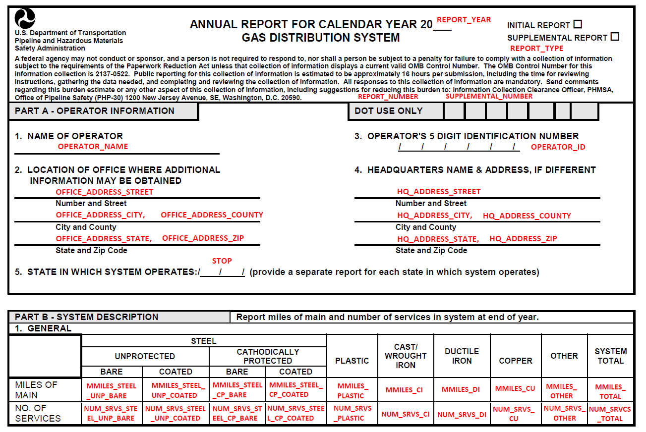
####Step 0: Look at Data First I downloaded the data to see what was available to us. This particular data set comes with documentation that is a copy of the form that gas operators must submit yearly to PHMSA, and the answers are the field names. There about 230 columns (questions asked), and more than 1,600 operators nationally.
Part of the form that operators are required to fill out
The columns I was interested in were:
-
Operator name
-
State in which the operator is operating (which I discovered can be different from the company address and HQ address)
-
Mileage of leak prone materials, which include four materials: Unprotected Bare Steel, Unprotected Coated Steel, Cathodically Protected Bare Steel, and Cast/Wrought Iron
-
Number of leaks by cause; causes are categorized as Corrosion, Natural Forces, Excavation Damage, Other Outside Force Damage, Material or Welds, Equipment, Incorrect Operations, and Other
These numbers are provided for each operator, both for mains (pipelines from the distribution center throughout a city) and services (smaller pipelines from streets to a home or business). There is additional information about the age and size of the pipelines that I haven’t used yet.
I spent quite a bit of time looking at the copy of the form, and then looking at the columns of interest in Excel. There were a lot of zeros- many of the operators in both Minnesota and Indiana had 0 miles of leak prone pipeline.
I decided that what I wanted to create was a stacked bar chart that showed the total mileage of each of the four leak prone pipeline materials color-coded by operator so we could see which operators had the most of those pipelines. I would create four bars for mains, and four for services.
For leaks, I would do something similar: create a stacked bar chart that showed total number of leaks for each cause color-coded by operator so we could see which operators had the most leaks as well as which of the causes caused the most leaks.
Once I knew what I was looking for and what I wanted to do, I could take map out the steps for the exploratory analysis I wanted to do:
####Step One: Get Data Download a clean copy of the data from PHMSA, in an Excel spreadsheet
####Step Two: Filter Filter the data to get only the state and pipeline information we want: I was working in Excel, so I used the Filter and then copied the records for the state I wanted and put it in a new tab. Then I would highlight the columns I was interested in- about 13 of the 231.
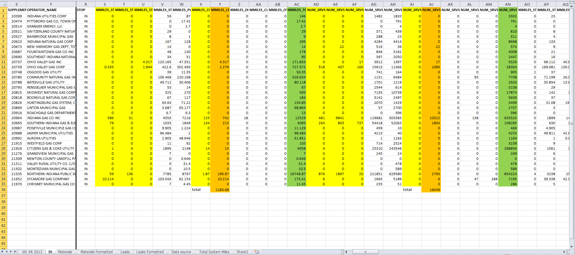
####Step Three: Reformat Reformat the data to create a stacked bar chart: I learned that to create a stacked bar chart, the data needs to be transformed from the wide form to the long form. I decided to first get rid of all the records that had all zeroes for the leak prone pipeline materials, and then manually reformat the data to what I needed (at this point I definitely knew there was a better way but I had a deadline). I created more tabs to hold the reformatted data.
Wide Form
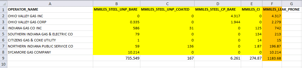
Long Form

####Step Four: Plot Upload the reformatted data into Tableau Public to make a stacked bar chart: I decided to try out Tableau Public because it allowed me to create interactive visualizations on the web without knowing any Javascript. For example, there are tooltips that allow you to see what a specific part of the chart represents. For the exploratory purposes of this analysis, I thought that was useful.
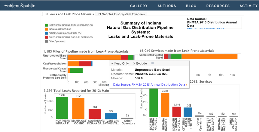
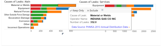
See this dashboard on Tableau Public
This methodology got the job done and allowed us to explore the data visually in an online dashboard. Now that I’m more familiar with the data and what we’re looking at, I have thoughts on how to make this process better for this analysis, and also some fun ideas for a more interesting future analysis.
##Next Steps
-
We’re working on another state over the next year, so I have the opportunity to try a different method. I’m attempting to do the filtering and reformatting using the statistical software R to make tables of the variables that interest us, and some summaries of them (totals, counts, etc.). With this method, once I do one state, I could easily do them all! So much better!! I could still put these tables into Tableau Public if I wanted graphs. Or I could try out Plotly.
-
Or, I am also hoping to learn how to make static charts directly in R, bypassing Tableau Public. If I can get charts that tell the same story that I can get in Tableau, I can also automate this process and save a bunch of work re-learning how to use the newer version of Tableau Public and formatting a dashboard. I suspect that some user testing could help me figure out what the most useful details to highlight are and then maybe I don’t need the Tableau Public functionality. Maybe I could even start to make explanatory graphs!
-
I also have some ideas for additional exploratory analysis using more of the data- the data set is nation-wide, which means I could do state comparisons of things. The data set is also available yearly since 1970, so I could do a time series analysis and look at rates of replacement for leak-prone pipelines over time. I’m also attempting this in R.
##Conclusion
One challenge for me is that I have a hard time estimating how long it will take me to learn something new, especially if it’s fairly unknown to me. Without this estimate I can’t really determine if it would save time to learn another way now, like doing the analysis in R, or if it makes more sense to muddle through the way I already know just to get it done and move on. On the other hand, I can easily fall into the trap of “I have to learn this really complicated tool to do this relatively simple task that I could have done another way”, just because I want to learn the tool. Sometimes it depends on what my other workload is, and also what I think I might use the tool for in the future. When I heard we might want to do more than one state at a time or look at national data, I knew it was time to make the investment to learn a better way. Stay tuned!
Read Part 2 of this project